Shelter Insurance
Transforming the customer dashboard

Project overview
Timeline: 2.5 months (2024)
Impact: 100,000+ unique monthly customers
Role: Junior UX Designer
The starting point
Shelter Insurance's logged-in experience hadn't been updated in 15 years.
While customers could access basic functions like bill pay and ID cards, the outdated interface made even simple tasks feel cumbersome.
As a newly promoted UX designer, I saw an opportunity to transform our static homepage into a comprehensive dashboard serving 100,000+ monthly customers.
The challenge: our customers were lost
User feedback painted a clear picture of frustration:
“It feels like I'm just looking at a list. I can see my policies, but I can't tell what I should do here." - Participant feedback from usability testing
This qualitative feedback was backed by our Google Analytics, showing a clear disconnect about where customers were actually going:

Yet all these features required additional navigation steps, leading to frustrated customers and increased support calls.
Discovering the hidden cost of poor navigation
Rather than jumping straight into solutions, I needed to understand why customers struggled currently. After sifting through prior user research in our repository, three critical patterns emerged:
Everything looks important, so nothings important
Important alerts stacked at the top without clear priority
Same layout for every policy regardless of what needed attention
Context is missing
Customers don’t know if any tasks need attention
No distinction between overdue bills and bills that will be due soon
Mobile view is a struggle
Stacking on mobile required lots of scrolling
Customers struggled to find Road Assist, which is critical for mobile users

The pivot point: from static to dynamic
A realization changed my approach: needed to stop thinking about our homepage as a list and start thinking about it as a comprehensive dashboard for our customers.
A mobile-first design approach forces me to prioritize what truly matters in the most constrained environment.


Design challenge: fighting information overload
My biggest challenge wasn't what to show - it was what to hide. My first iteration tried to show everything in a two-column layout, but my design team provided valuable critique:
"There's a lot happening, I'm not sure where to look first. Which of these things actually need my attention?" - UX team design critique
This early feedback from my team helped identify key issues:
Too many competing elements
Lack of clear visual hierarchy
Overwhelming amount of information

Making billing clearer
A unique challenge emerged around payment display. With multiple policies (home, auto, etc.), test participants were confused about total amounts due:
"Wait, so do I owe $150 total, or is that just for my car insurance? I can't tell if I'm looking at everything I need to pay.” - Usability test participant
Through iteration and testing, I developed a progressive disclosure approach:
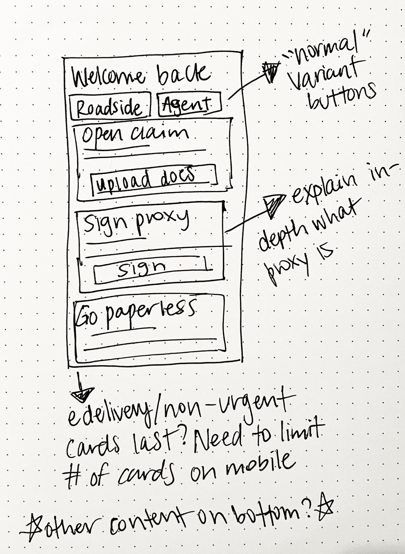
Only show one “pay bill” card, regardless if past due or not.
Multiple “pay now” cards were disorienting. By handling overdue bills first, we gave our users a more clearer route to taking care of payments they needed to make.
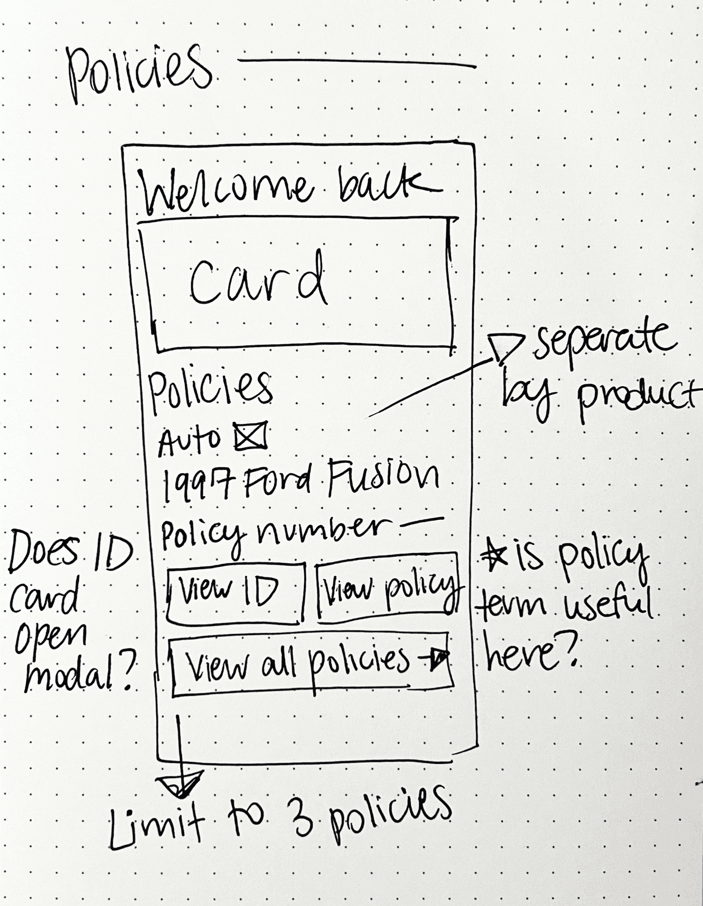
We also group bills and totals into one card, simplifying the payment experience. Users are then taken to our payments landing page to review totals, due dates, policy details, etc.

The breakthrough: priority-based design
Through multiple iterations, I developed a card-based system that:
Prioritizes urgent actions (overdue payments, open claims)
Progressively discloses additional information
Transforms based on context (desktop vs mobile)
Working closely with my development team early on helped shape feasible solutions.

Stronger through collaboration: the policy section
While I led the dashboard redesign, another UX designer on my team was developing a dedicated policy management experience. We saw this as a chance to:
Create consistency across both experiences
Leverage each other's user research insights
Build a more cohesive product
Data showed most customers have 3 policies or less, which helped me decide how many policies we wanted to display on our dashboard's more focused view.
Through collaboration, we integrated her policy list design into the dashboard while ensuring both experiences felt unified.

Mobile-first transformation
Mobile users have fundamentally different needs when opening their insurance carrier's website on their phone.
Prioritizing critical features
Added “contact agent” and “Road Assist” as prominent buttons
Positioned high-priority actions for easy access
Simplified layout
Limited dashboard cards to 4 (vs 6 on desktop)
Presented policy information in a scannable, vertical layout
Maintained essential functionality while simplifying the interface

Engineering partnership
Working with my developers, I learned each policy required separate API calls for payments, claims, and policy details.
Rather than showing a generic loading state, I designed thoughtful loading skeletons that maintained the page's visual hierarchy.

Balancing business goals
While focusing on customer needs, I also found opportunities to drive business value through strategically placed promotional cards:
Option to switch to paperless billing
Space for customers to give feedback
Recommendation for roadside assistance coverage
The key was ensuring these never overshadowed critical customer tasks by placing them after important content.

Final results: transforming the experience
Through 10+ usability tests and multiple iterations, I transformed a static homepage into a dynamic, customer-centered dashboard.
Transformed a cluttered interface into a comprehensive dashboard - prioritizing payments, claims, and policies
Designed clear policy overview with ID cards available to view and print
Customized the experience for each device: easy-access emergency buttons on mobile, clear dashboard layout on desktop
Created a flexible card-based system that adapts to different user contexts and needs
Post-launch metrics


Refining through data
While the dashboard improved most metrics, post-launch data revealed an unexpected challenge: proxy signatures had decreased compared to the previous year.
Although we had made proxy voting easier to understand, moving it further down the page had impacted discovery.
I designed a solution that balanced visibility with our established hierarchy: a proxy card that appears after urgent tasks. After approval from our legal team, the solution will soon launch.

Since design is an ongoing process of learning and iterating, we'll continue monitoring signature rates as this solution launches.
Enjoyed this project? Read about my capstone project, Curly Journey.